home
WFA - Talent Acquisition

Talent Acquisition (TA) is an extension of Workforce Analytics (WFA), a web application developed by Visier Inc. to aid businesses in understanding, retaining, and managing their workforce.

TA connects and integrates historic data across multiple workforce HR systems, enabling organizations to ask the right business questions and make data-driven decisions about hiring and retention.

Workforce Analytics

New Challenges

When I joined Visier, I initially worked on supporting it’s main product - WFA, designing and supporting various small features and UI components. In early 2016 however, I was very lucky to have been involved in the inception, design, and execution of Talent Acquisition.

The new application was to be built in HTML, and as WFA was a flash-based web application, most of the development work was non-transferable. This was an exciting opportunity as it allowed us to explore new design and navigation patterns for the product with a clean code base.

My Role

As junior designer, I worked closely with a senior designer on various features across the application. I also collaborated with other designers as well as development teams to support feature implementation. I was responsible for conducting user research, prototyping, concept development and improving current UI components.

Setting the Constraints

One of the key values provided by Talent Acquisition is to enable any analyst to accurately curate data journalism articles (we call them Analyses) to answer vital business questions. The data represented in these analyses doesn’t need to be managed, as it automatically updates when new data is loaded into the platform.

Alongside another designer, I was tasked with designing and creating much of the initial structure and experience of analyses, including navigation and interaction within complex visuals, chart organization and analysis layout rules. The goal was to create an analysis experience that is:

  • Flexible: Able to create complex analyses with many charts and visuals to something simple like a dashboard.
  • Engaging: Able to easily interact with chart visuals to discover additional insights.

Cards and Moving Pieces

So that’s great. We have an idea for a new product, but where do we start?

One of the key roles I played in this massive undertaking was to design the layout of the analyses, specifically how to efficiently consume a large volume of charts on a single screen but to also create an engaging article. The only piece of the puzzle we had was that we wanted to represent chart visuals as resizable cards.

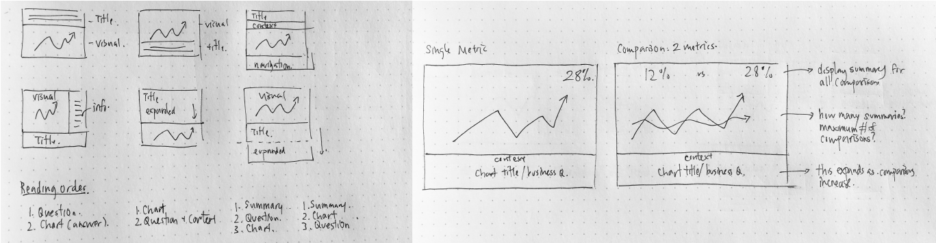
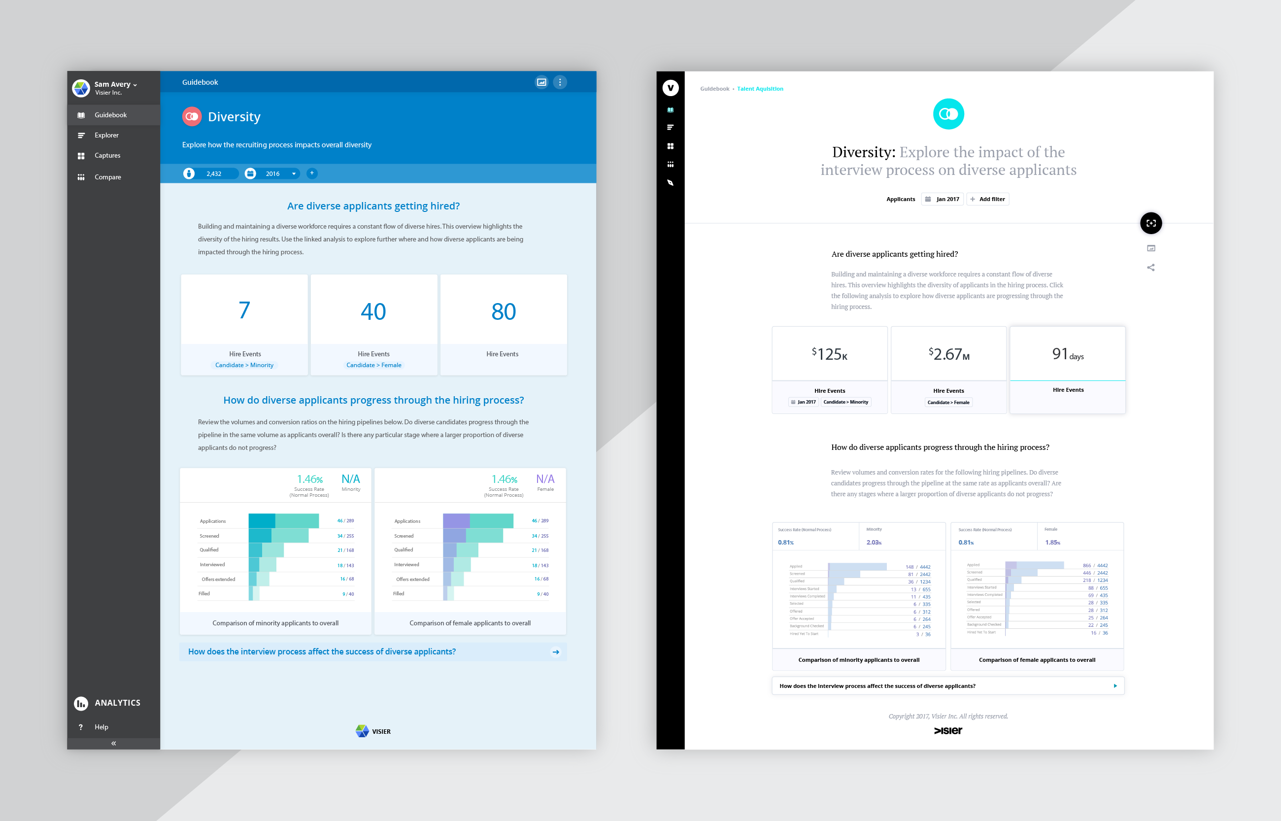
Determining placement of information on a card: natural reading order vs overall flow of information.

Designing a responsive card layout is simple, but unfortunately our cards were not. Each card must display an active visual that changes depending on the card size. Cards must also display additional information in order to tell a coherent story, so that consumers can scan and comprehend the data without having to click into the card. This data includes, a business question, time and filter contexts, a unit summary as well as the visual itself.

Early concept sketches for chart interactions.

Numerous variations of cards were meticulously crafted and compared to find the perfect balance between card interactions and displaying the minimum required information. To make things even more complicated, visuals on the card allows for hover interactions over data points to discover more information in addition to a primary navigation to a full sized chart for in-depth review. As an extension to card details, I also explored interactions on the interactive chart title when cards were expanded to fullscreen.

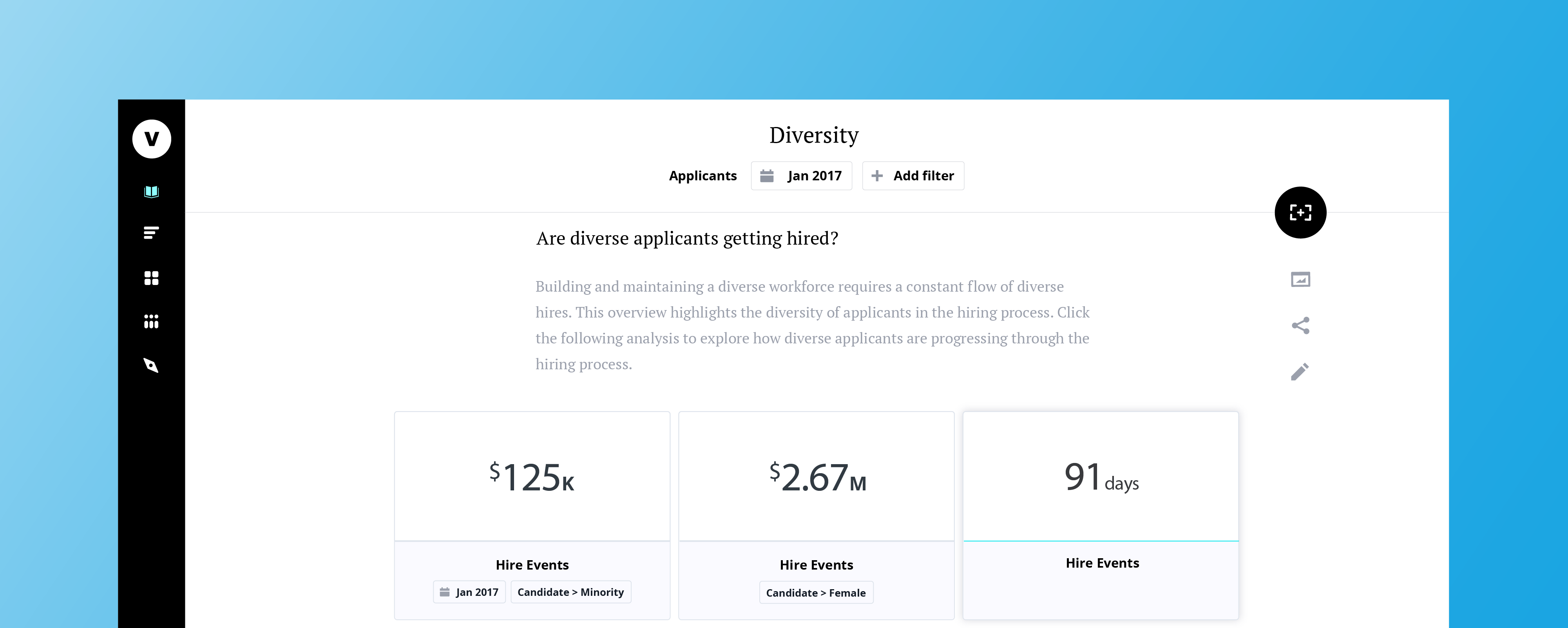
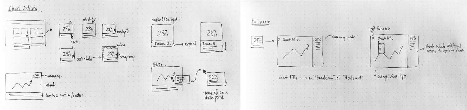
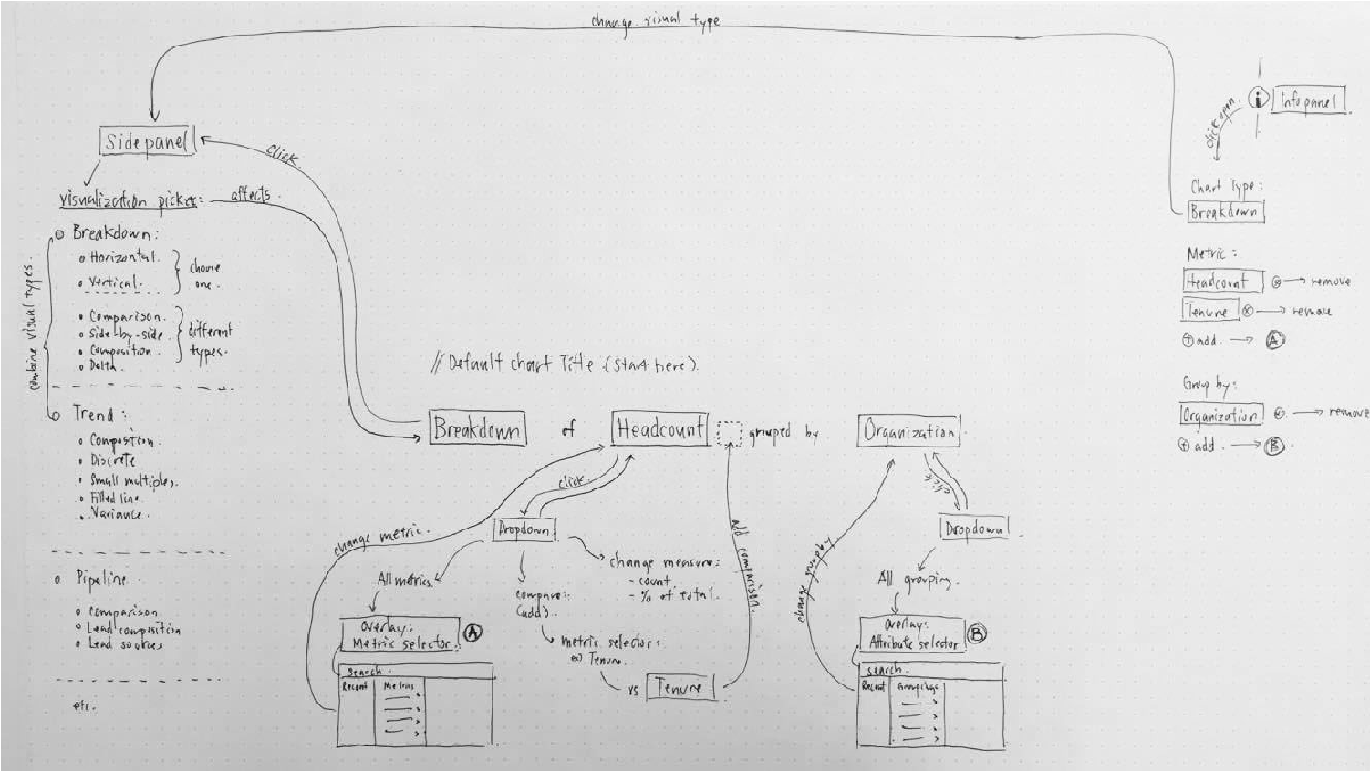
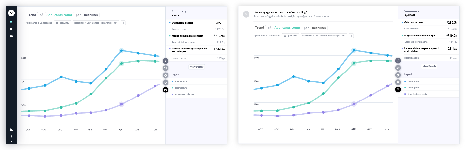
Chart title breakdown and interactions

Small, Medium, Large

There were two types of responsive cards, the first being truly responsive as cards resized depending on the browser, and the second are interchangeable card sizes. We chose the latter as well felt that it would best communicate the visual complexity of our cards. Three cards were designed: Smalls, Medium, and Large, with each providing more and more information as it grew.

While the cards displayed more information depending on its size, it is not a different card. To stress that these cards belonged to a set, we strategically placed the summary number in a prominent location to visualize a connection between them. We designed various combinations of cards and views and tested these scenarios by creating quick wireframes and prototypes.

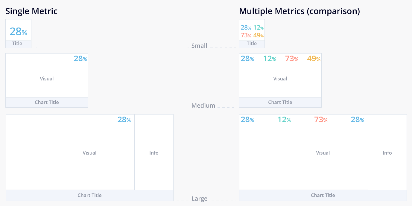
Summary numbers are used as a point of reference when cycling between card sizes.

With our cards designed, we were ready for the next step: designing the overall layout. I had previously done a first round of testing with card layout when designing the cards and outlined two simple rules and a difficult question:

  • Rule #1: A row can only have the same sized cards with a maximum of 6 smalls, 2 mediums, and 1 large card on the row.
  • Rule #2: If a card changes size, new rows will be automatically created as per Rule #1.
  • Question: Should cards be centre-aligned or justified and stretched?

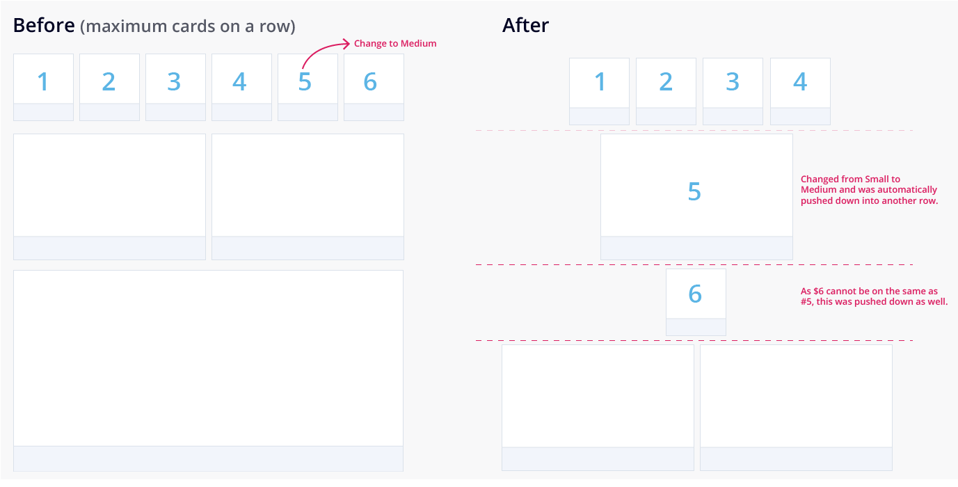
Layout is automatically handled by the application when cycling through card sizes.

Testing various layout options for readability as well as visual aesthetics.

In addition to these rules and questions, we also tested for scannability, ease of reading, and visual layout through a series of A/B tests created with mock data. The consensus after testing was that center-aligning the content was much easier to read but cards should be stretched to fit in order to maximize the use of space.

Delivery

Although much of the visual design has changed considerably since the company’s rebranding to Visier People, the layout logic and rules that I crafted are still an integral part of the data journalism experience for Talent Acquisition. We achieved a flexible design that can grow and accommodate for new chart visuals, and an engaging analysis experience with interactive cards.

Layout at Beta Launch (left) versus layout after rebranding as Visier People (right).


Core Workflow: Ad-hoc Exploration & User Edits

With the beta phase of Talent Acquisition rolling out, we began to get some user feedback on some of the initial workflows we designed. One workflow that required our immediate attention was chart interactions and saving user changes. Interactions for content authors and consumers were different but the separation wasn't clearly defined.

In this case, there is a core Exploration tool in Talent Acquisition which allows users to freely explore and create chart visuals at any time, however this tool can also be accessed as an Edit Mode via a fullscreen chart visual while in an analysis. This was creating confusion with core navigation and causing users to lose their work.

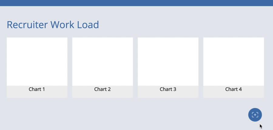
Explore tool (left) and a Fullscreen chart (right) look similar but have different interaction patterns.

Problem with Saving

An example of the problem exists when a user is consuming an analysis that is shared with the entire organization. They are free to view and interact with any of the chart visuals, even changing metrics and comparisons for ad-hoc exploration. However, if they forgot to switch to Edit mode before editing, all their changes will be lost upon exiting fullscreen. So how do we smartly save user input and differentiate it from ad-hoc exploration?

I began by reaching out to some of our users and experts in the industry for initial feedback on the current implementation and to find out what their problems were. It became immediately clear that none of these users had any idea or cared about how navigation works. After observing how analysts were using our application, I noticed that their primary goal was to explore an analysis, and if it’s possible, quickly save some of their thoughts.

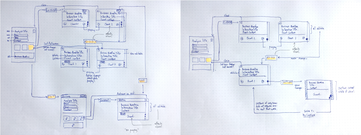
Current workflow with Edit Mode (left) vs. New workflow with Capture (right).

Capture Charts

Instead of entering an explicit mode to save your work, I proposed that we get rid of Edit mode entirely, and turn the Save action into a global action: Capture. This prevents users from accidentally saving over curated analyses, and also allow them to save their work at any time. With Capture, I successfully introduced a familiar, but new concept into the application while also removing the complexity of having multiple modes.

Capture 1

Testing capture card hover interactions: Persistent Overlay

Capture 2

Testing capture card hover interactions: Full Overlay.

Feature: Predictive Analysis

With enough historic data, WFA is able to run certain algorithms and accurately predict outcomes for impactful business scenarios. Running predictive analyses, such as how many new hires will they need to grow the company, enables our customers to make data-driven decisions that will eventually benefit their business. In addition to positive outcomes, customer analysts will also be able to view any routes to negative outcomes and be able to take immediate action to avoid them.

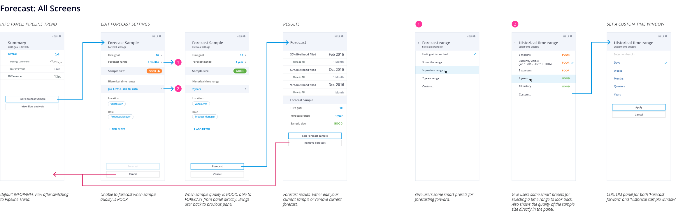
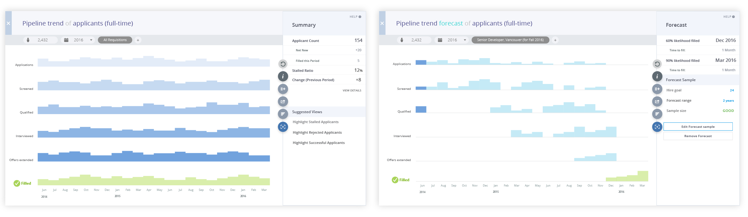
Flow for editing and applying forecast sample.

Predictive analysis depends on the size of the historical data provided. The larger the range, the larger the sample size needed.

I worked closely with Visier’s data scientist to design a complimentary workflow for his algorithm. The first step was to break down the complicated algorithm into friendly, consumable chunks, mainly the core inputs needed to make the calculation. The proposal reflected a simple range of numbers analysts can enter to create their own forecasts, hiding away the complex mental model behind predictive analyses.

Outcome

The results was an intuitive workflow that guided analysts in creating their own predictive analyses without having to apply a complex algorithm by themselves. This was a key feature and was part of Visier’s demo at HR Tech 2017, resulting in Visier being named HR Product of the year by Human Resource Executive.

Key Contributions to Talent Acquisition
  • Designed the infrastructure for key workflows: Analysis & Card Layout, Chart & Main Navigation.
  • Directed user research and focus groups before and during beta launch.
  • Designed core features such as Analysis Authoring, Capture Charts, Predictive Analyses, but also contributed to countless other features (Comparison, Differences, Focus, Legend).